
Love Reborn · Manali, India
From the first scroll
to the final
wristband.
One connected festival experience. I led the creative direction and digital experience for Voodoo Valley’s fifth edition, from its five-month campaign to the moments on the ground.
Follow the experience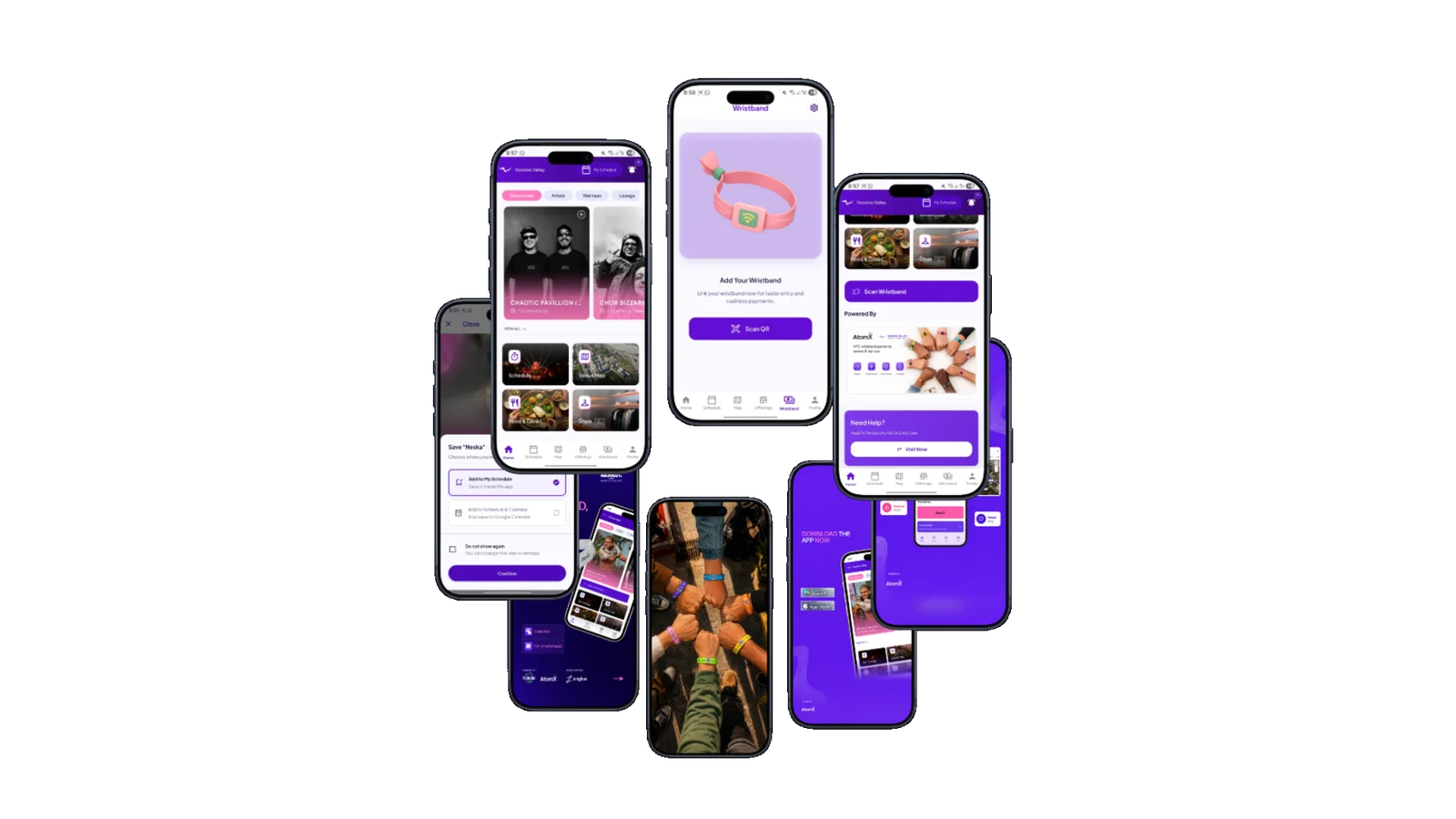
- 2026 edition
- Sold out.
- Full-campaign impressions*
- 27.5M
- Unique website visitors*
- 121K
*Post-festival figures supplied for this case study. Campaign impressions reflect the combined work of the wider festival team.
The brief
A new chapter.
A recognisable world.
The fifth edition needed more than a visual refresh. The goal was to evolve the familiar 2025 identity into a cleaner, more mature system—and carry it across every major audience touchpoint.
That meant connecting the campaign, website, owned ticketing, automated communication and festival app while artist announcements, sponsors and operational information continued to change.
01 / Evolving the identity
Keep the spirit.
Refine the expression.
Nature, music and community already defined Voodoo Valley. I retained that familiarity while introducing a more consistent visual and messaging system for 2026.
The recognisable core.
The logo, selected colours and an authentic photography approach kept the edition connected to the festival’s existing world.
A clearer visual language.
A new typographic system, cleaner layouts, bold scale, rich violet tones, surreal natural imagery and metallic details gave the new edition its own character.
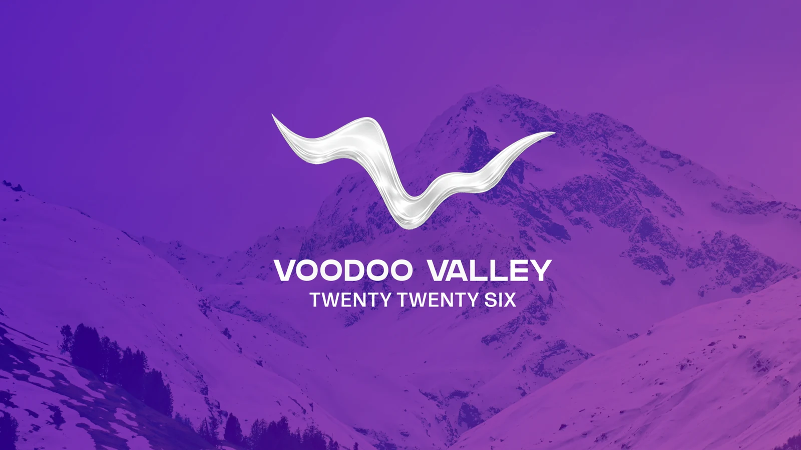
The familiar emblem, reinterpreted in a metallic finish against the Himalayan landscape.
#7026F4#CDB7FF#FF71D5#F7F1FFColour swatches from the original design file. The campaign balances electric colour with quieter backgrounds and authentic imagery.
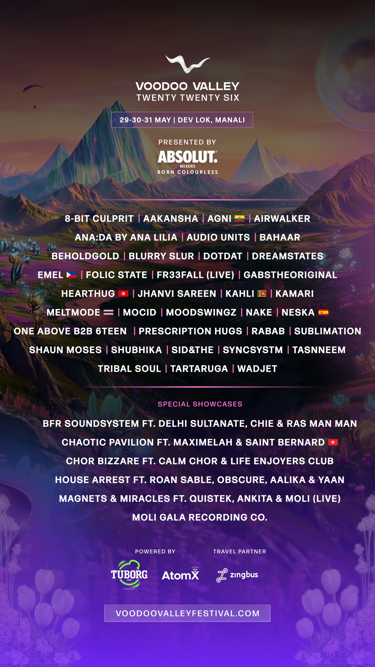
One composition brings the identity, artist lineup and partners together.
A system built for festival speed
Keep the rhythm.
Even when the plan changes.
Late sponsor confirmations and operational updates still needed to reach the audience quickly. Reusable rules for type, colour, imagery and hierarchy kept each new release part of the same festival.
- Campaign rollout
- 5 months
- Social posts & carousels
- 45+
- Reels & videos
- 20+
- Newsletters
- 2
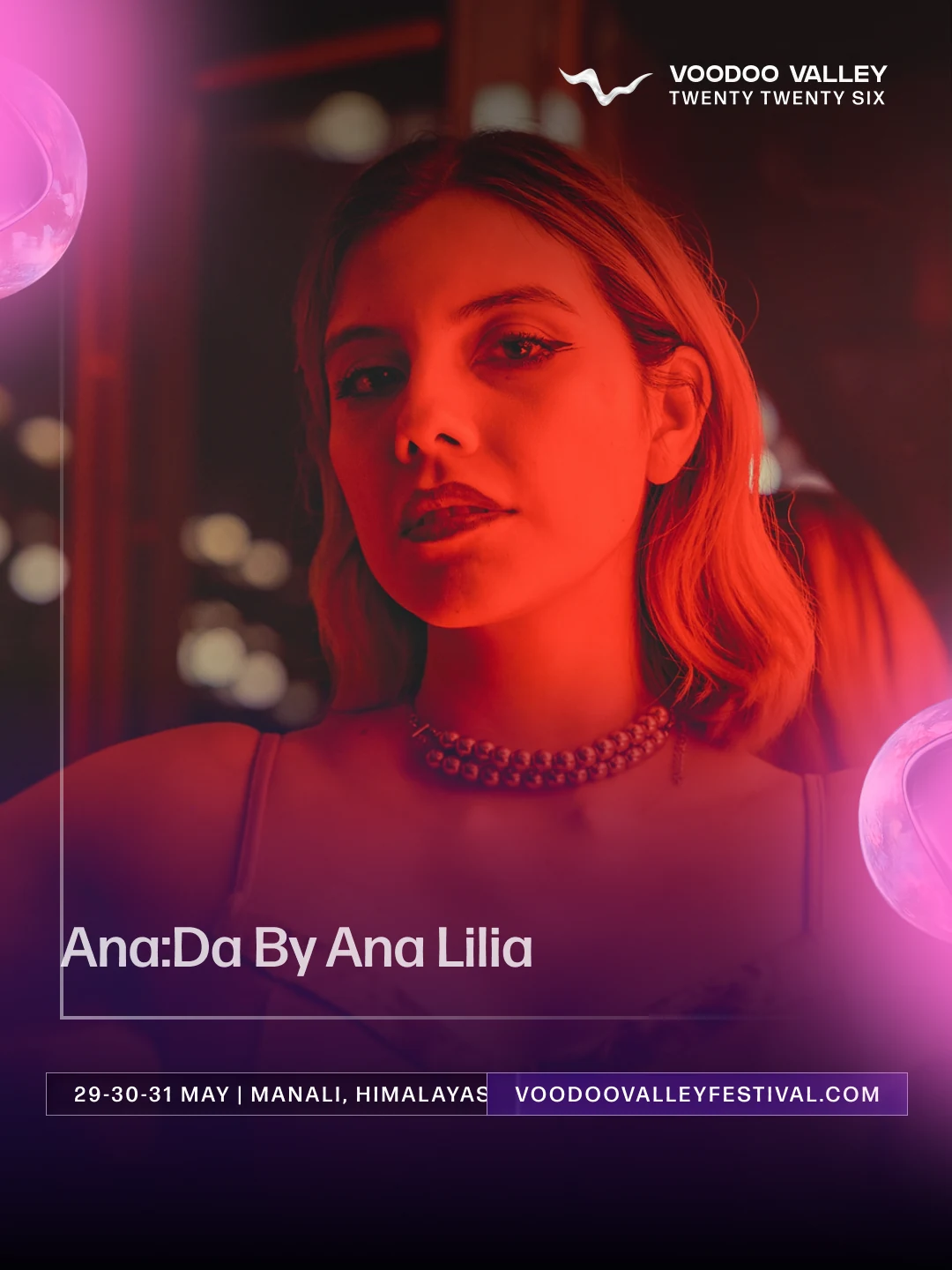
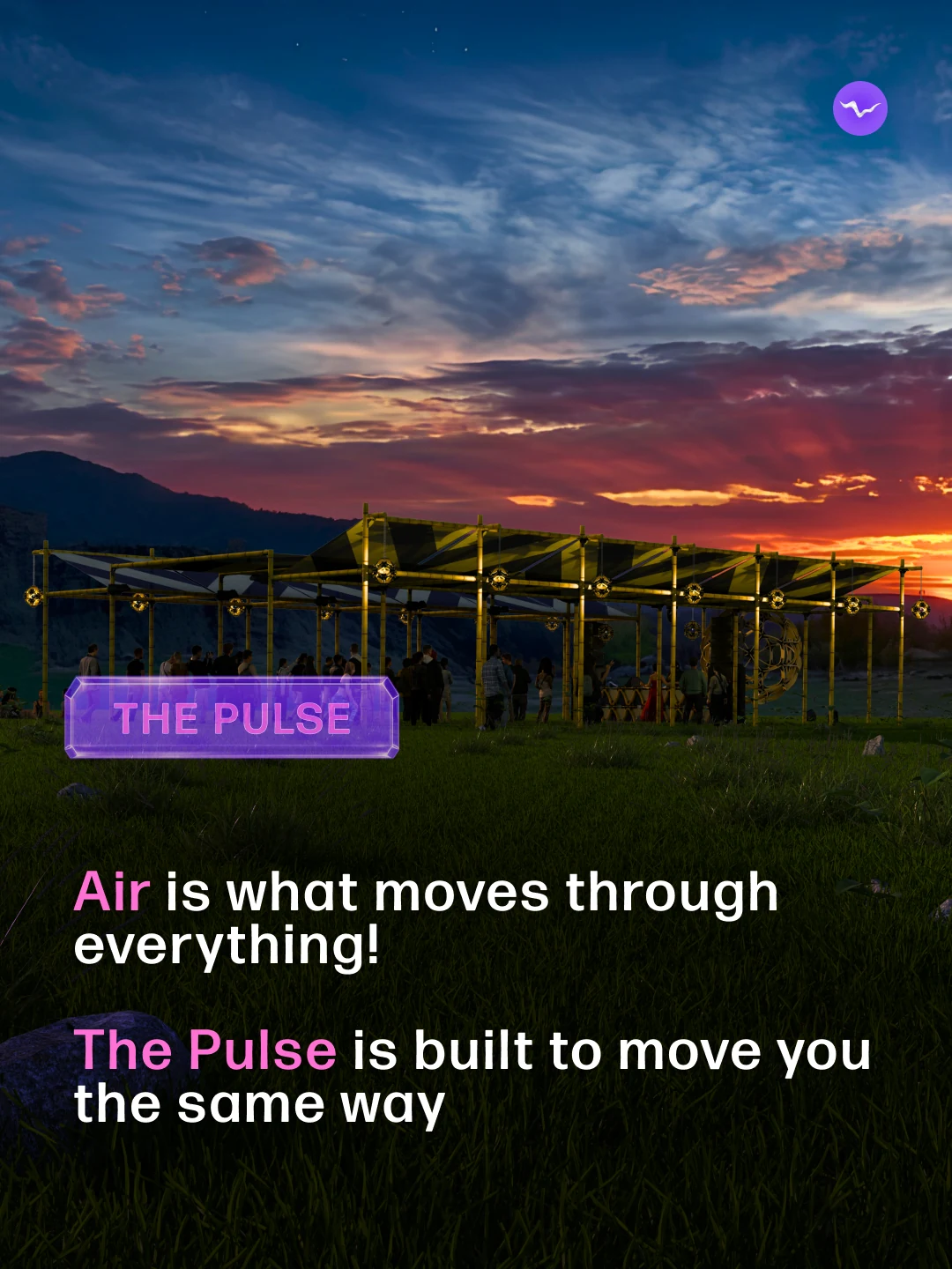
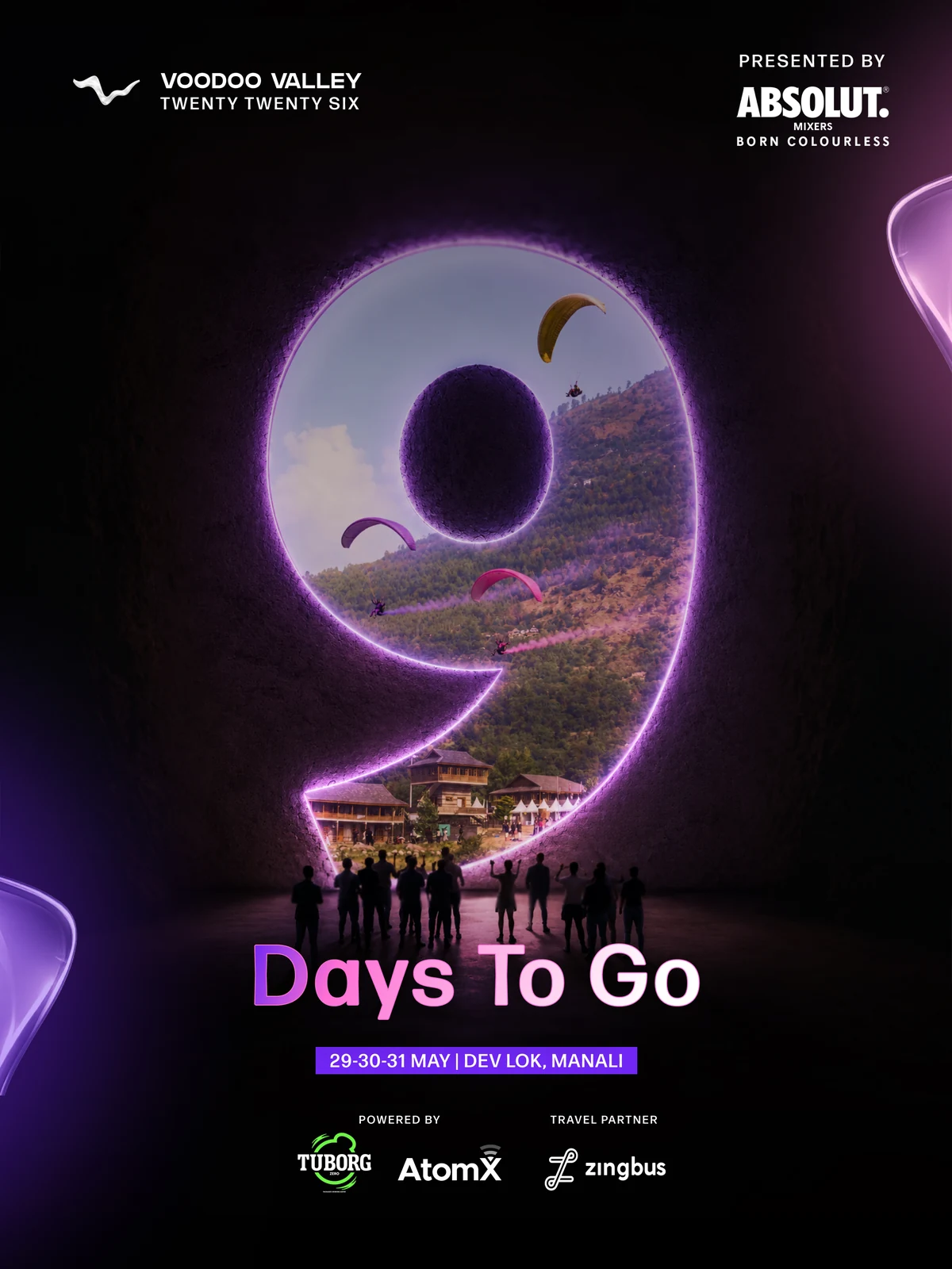
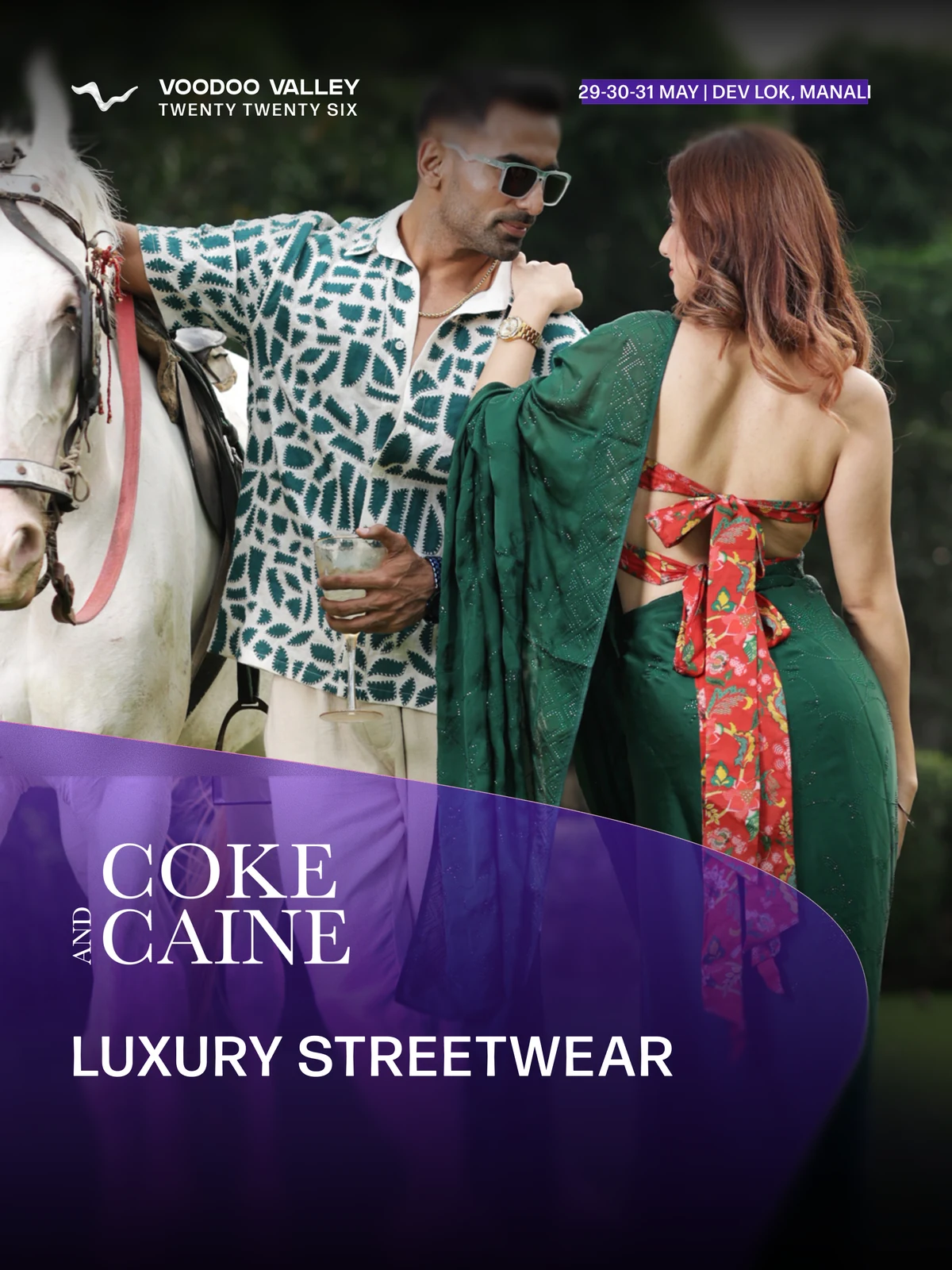
Original 2026 campaign artwork. Photography and raw footage were supplied by the festival team; one video editor supported production.
I owned creative direction and campaign design. The festival team managed and optimised paid Meta advertising.
02 / Website & owned ticketing
Keep the journey
inside the festival.
I designed and developed a responsive Wix Studio website with more than eight pages, connecting artists, experiences, accommodation, venue information, FAQs and editorial content to ticket purchase.
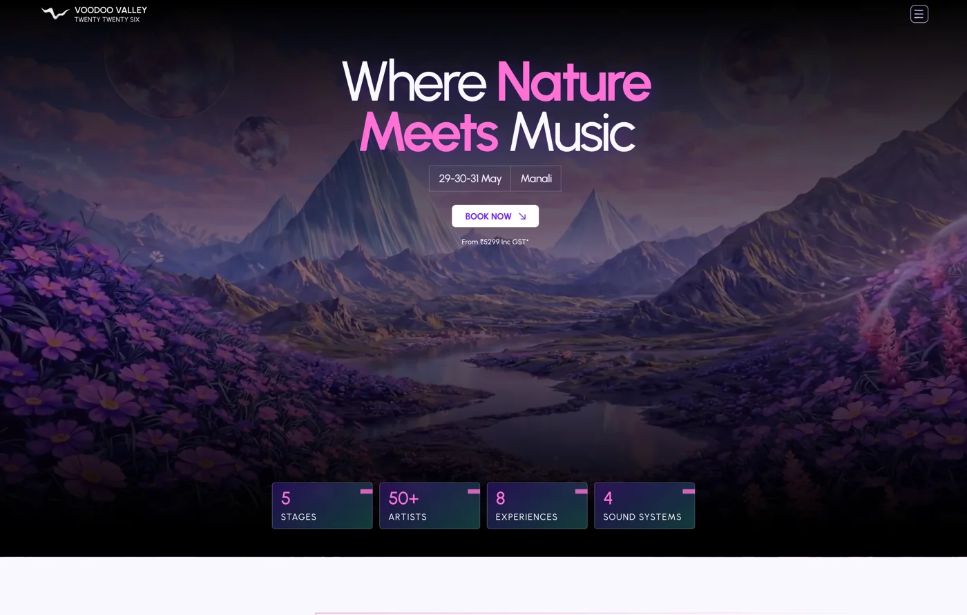
Production website capture from 30 April 2026. The festival world and booking entry point share one visual language.
Beyond the checkout screen
An owned experience,
from payment to arrival.
Razorpay handled payment. I built the surrounding workflow for ticket selection, payment confirmation, QR generation, custom PDF tickets, automated emails and reminders.
The festival gained control over the customer experience and data, with better opportunities for tracking and remarketing.
Flow A / Discovery to entry
- 01
Discover
Meta campaign or referral
- 02
Explore
Artists, experiences, venue and stays
- 03
Choose
Ticket or package selection
- 04
Pay
Razorpay payment
- 05
Receive
Confirmation email + PDF ticket with QR
- 06
Prepare
Reminder communication
- 07
Enter
QR ticket check-in
03 / Connecting digital and physical
The ticket gets you in.
The app keeps you connected.
I designed the app experience for wristband connection, balance and top-up, artist schedules, notifications and an interactive festival map. AtomX handled technical development.
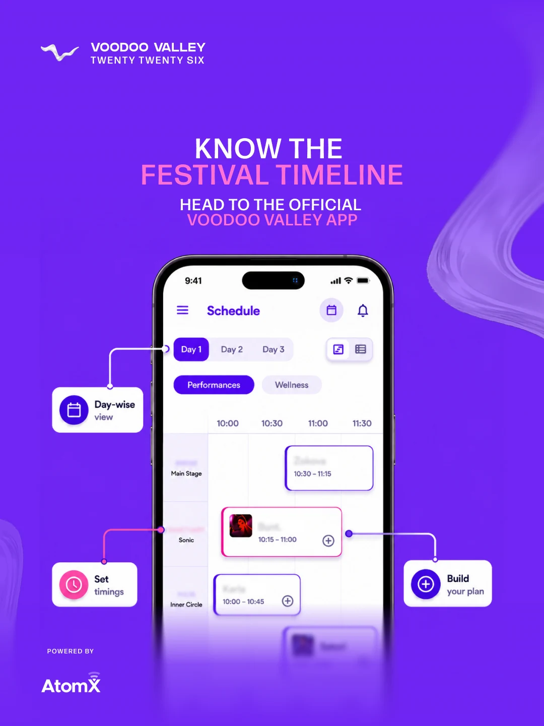
Campaign mockup introducing the festival schedule.
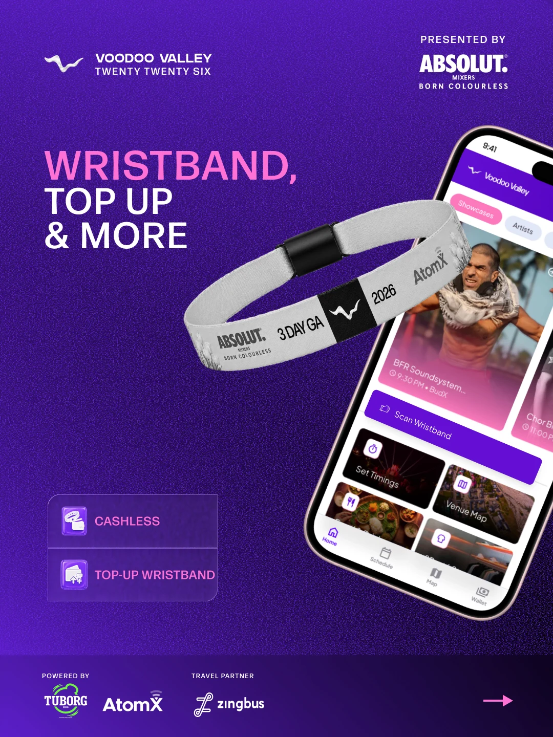
Campaign artwork explaining wristband connection and cashless participation.
Flow B / Entry to cashless participation
- 01
Collect
Festival wristband issued
- 02
Connect
Link the wristband to the app
- 03
Top up
Add money to the balance
- 04
Participate
Cashless food and drink purchases
- 05
Explore
Schedules, notifications and navigation
The hardest design problem
A temporary venue.
A map people could trust.
The most demanding part was translating a changing physical site into useful navigation. A well-designed screen depended on getting the real-world locations right.
I walked to each stage, toilet, first-aid point and other essential location during venue setup. At each point, I captured its latitude and longitude with Apple Compass, documented the coordinate in screenshots and transferred it into the app’s mapping system.
Flow C / Location mapping
- 01
Confirm
Identify the location during venue setup
- 02
Capture
Record latitude and longitude on site
- 03
Transfer
Document and add the coordinate to the app
- 04
Categorise
Assign the location type and map marker
- 05
Navigate
Make the point available to festival-goers
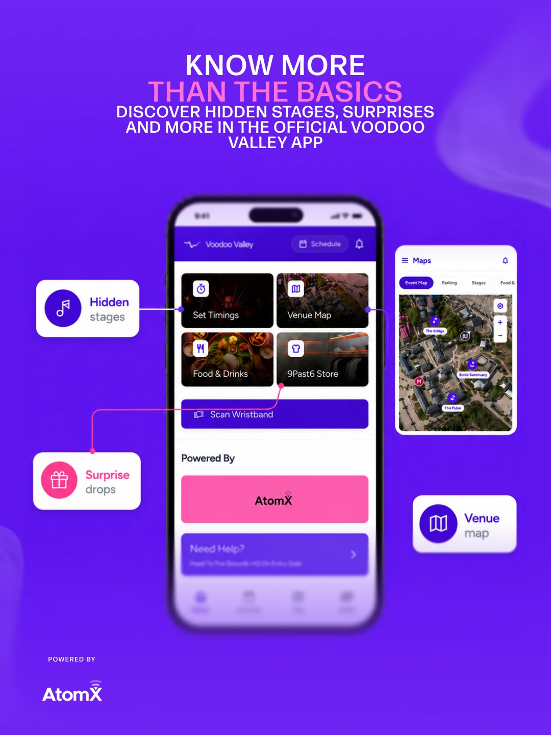
Original app-promotion artwork. The map inset illustrates the navigation experience.
Designing for the visit
The map had to connect
to the ground.
Stages, parking, toilets and first aid needed to be easy to locate while moving through the festival. The interface brought those practical needs into the same visual world as the campaign.
The coordinate workflow above explains how the physical locations became digital points. The launch artwork shows how that navigation was introduced to visitors.
App UX/UI by Danish · Development by AtomXHow the work came together
One creative system.
Carried through delivery.
- 01
Audit & direction
Review the 2025 identity and audience touchpoints. Define the new direction, message hierarchy and brand guidelines.
- 02
Build & release
Design and develop the website and owned ticketing. Roll out the five-month campaign with the festival team.
- 03
Connect & learn
Design the app and on-ground touchpoints. Review Wix Analytics, Microsoft Clarity and Meta reports, then consolidate the post-festival findings.
04 / The outcome
A sold-out edition.
A connected experience.
The 2026 edition brought the campaign, website, ticketing and on-ground experience into one recognisable world. These are the reported results, with their scope kept clear.
The campaign
Combined results of the wider festival team
- Full-campaign impressions
- 27.5M
- Full-campaign reach
- 8.5M
- Instagram follower growth
- 50%
Approximately 12K → 18K
Source: post-festival campaign figures supplied for this case study. Paid Meta campaigns were managed and optimised by the festival team.
The digital journey
Website and communication performance
- Unique website visitors
- 121K
- Website sessions
- 143K
- WhatsApp open rate
- 17%
- Newsletter click-through rate
- 8%
Source: website and communication results supplied for this case study. Visitor counts, sessions and channel engagement rates describe different measures.
At the festival
Three days in Manali
- Total visits/check-ins across three days
- 7,660
- Cities represented
- 102
- Countries represented
- 19
Source: post-festival attendance figures supplied for this case study. The three-day total counts visits/check-ins, not unique attendees.
My direct ownership covered creative direction, campaign design, website and ticketing, communication automation, app UX/UI and analytics review. Campaign-wide reach and impressions reflect the contribution of the wider team.
He combines design thinking with practical execution, translating an ambitious festival concept into a clear, engaging and consistent digital experience.
One experience, all the way through
Come back
different.
The strongest result was a journey that stayed recognisable—from discovering the festival to finding your way around it.